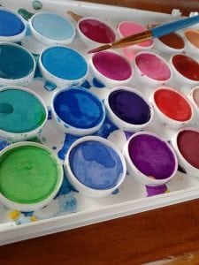
 Have you thought about choosing a color scheme that works for your blog? Color is an essential element of your blog. The palette you use is a representation of your blog’s brand and is actually the first thing people associate with your name.
Your colors should match the message you wish to send, and they should be consistently used in all promotional materials. Social media imagery, post graphics, blog banner and other promotional materials should carry out variations of the same color palette. With hundreds of colors available, choosing just a few can be a daunting task, so in order to help you, we’ll show some tips on how to choose a color scheme that will work for your blog.
With hundreds of colors available, choosing just a few can be a daunting task, so in order to help you, we’ll show some tips on how to choose a color scheme that will work for your blog.
Understand Color Theory
Color theory is the principle that color evokes a mood or feeling. Let’s look at the common associations that exist with some basic colors.
- Red has a lot of different meanings attached to it. It can be a symbol of love, but can also elicit anger. The shade you choose will help to define your intent and should likely be used sparingly in your designs.
- Blue is frequently attached to a feeling of sadness; however, it’s also been shown to evoke trust in consumers. Blue can be seen as serene and calming, as well.
- Green also comes with a wide array of meanings. Some people associate money with green, while health and wellness can also be represented by shades of green.
- Yellow is bright and sunny, signifying happiness and energy.
- Orange is another energetic hue that elicits an image of confidence and success.
- Pink is a color that evokes a feminine or compassionate vibe.
Basics of a Color Palette
You should choose no more than four to six colors for your palette. If you’re using black or white as main contributors, don’t count them toward this number. You can use up to three main colors for elements like your logo, header, graphics, backgrounds, and patterns. Choose one or two accent colors for a pop of contrast on buttons, bold text, and icons. Finally, you’ll want to add a neutral color or two to add balance. You’ll want to mix things up between dark, light, contrast and neutral colors.
Set the Mood
A good way to play with various combinations and to narrow things down is to create a board on Pinterest. You may set the board to private if you wish, and then start pinning images that create the tone of the vision you have for your brand. If you have certain colors in mind, use them. Otherwise, just start pinning images that interest you to see if a pattern develops. You can then discard pins that don’t make sense and use what remains to pull from. If you have Photoshop, you can create a mood board with that software and use the eyedropper tool to grab colors from the board. If this step is too advanced, look for websites like Adobe CC or ColourLovers to generate your palette.
Obviously, this may take some learning but have fun and go with your instincts and don’t let yourself become overwhelmed with obtaining the perfect combination. Choosing your brand’s color palette is a fun and creative process.
Leave a Reply