Understanding how each element of your blog comes together is essential for the long-term success for your business blog. After you’ve gained some experience with using the platform you’ve chosen, it’s a good idea to take a close look at each area and learn what can, and perhaps cannot be, optimized to suit you best.
Besides the visitor traffic counts, the overall structure and pieces of your blog can help to increase exposure.
Keep in mind that every area of the blog can help your site become more search engine-friendly. Not only does this reduce overall marketing costs when you are trying to obtain search engine rankings, but you’ll also start to see more ‘organic’ traffic simply by tweaking a few areas.
Everything from the blog layout, the template you choose, and the fonts and colors you use will have an impact on your final blog.
You’ll want to choose wisely when it comes to each area, especially paying attention to color schemes and other themes that may help with branding purposes.
Layout and Basic Composition
The layout is a part of your blog design, and your goal is to create something that will leave a lasting impression. More and more blog networks are creating ‘generic’ blogs that have very little creativity and are focused more on the new content instead. Even though the content of your blog is the critical element, what the visitor sees and feels as they explore your blog is just as important.
If you choose a simple layout and design, just makes sure to navigate it yourself and see what your focal point is. Are you focusing too much on the sidebars? Is the header distracting? Can you easily read the content, or do you have to squint to make sense of the font and style? All of these elements will be unique to your blog, and since it may be an extension of your company and brand, it’s vital that you use something that will make a lasting impression.
The blog layout consists of:
- Fonts
- Color themes
- Line spacing
- Header styles
- Image boxes
- Advertising space
- Columns (one-, two-, or three-columns)
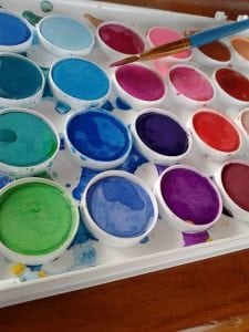
 Picking Appropriate Color Themes and Palettes
The first step in constructing an appropriate layout involves the color theme. You want to use colors that either match or complement your main website, or even just go along with your printed materials. Remember the value in branding, especially if you have traditionally been an offline company and are now moving things ahead on the web.
Color psychology can have a positive or negative effect on every single visitor that reaches your site, and you can make the most of your branding strategy by using special colors that evoke specific feelings. The following colors are generally associated with different emotions, feelings, and reactions in both positive and negative ways:
Red
excitement, warmth, energy, and stimulating in the positive, but aggression and excessive visual impact in the negative. Red is a strong and powerful color, and can be used properly in subtle ways. It demands attraction and recognition, but can also be perceived as overly aggressive.
Blue
intelligent, cool, efficient, and trustworthy in the positive, but unfriendly and aloof in the negative. Blue is essentially soothing, and the different hues can create a peaceful and serene feeling. However, it can also be perceived as cold and unemotional so you will need to pick the right tone to deliver the appropriate message.
Yellow
confident, creative, strong, and friendly in the positive; depressing, irrational, and even fearful in the negative. Yellow is a very stimulating and energizing color, but overusing it or using the wrong tone can work against you.
Green
balance, rest, peace, environmentally friendly in the positive, but bored, bland, and stagnant in the negative. Green can be used in very positive ways for a refreshing and energizing color palette, but too many dark tones can be perceived negatively.
Orange
warmth, security, fun, and abundance in the positive, but frivolity and disorder in the negative. Orange is a very energizing color, and can also attract immediate attention; however, too much of it can indicate foolishness or not being taken seriously enough.
Pink
femininity, love, tranquility in the positive, but weakness and inhibition in the negative. Pink can be soothing and attractive but can be draining and overdone very easily.
Avoid using it unless it clearly matches and represents your brand.
Brown
seriousness and warmth in the positive, but lacking in ‘flavor’ or taste in the negative. Strong browns can be helpful as accents, but a site completely done in brown can indicate boredom or lack of creativity.
Using powerful color combinations is very helpful when choosing the layout of your blog, and most blog platforms offer ‘color combos’ so you make the right choice. If you are designing your palette from scratch, just remember the principles of each color’s psychological impact and proceed accordingly.
Choosing the Number of Columns
 The number of columns in a blog has been debated time and time again, and there are both advantages and disadvantages of each. All blogs are set up in as one-column, two-column, or three-column structures. The best way to pick one is to simply choose something that suits your blog’s purpose. For example, if you plan on linking out to partner sites or other blogs, you’ll need a three-column structure. This will give you enough space to create a blogroll and relevant links on the right sidebar, include your blog commentary down the middle, and then put advertising and other links on the left sidebar.
A two-column blog is most advantageous for a blog that has limited advertising. You will still have space for an extensive link roll and perhaps some contact information, but all reading will take place on the left side of the page.
A one-column blog is very basic and is a good place to start if you want the blog to stand alone and not link out to different areas.
This will help you create immediate interest to the content itself, and will definitely be less distracting for most web visitors and readers. Sometimes a minimal look works better, especially if you have a lot of content that requires attention.
Font Styles and Your Blog
 Unless you are using a customized blog template, there are only a few standard font styles to choose from. This is not necessarily a bad thing since most web users are becoming with the typical font styles such as Arial, Times New Roman, and Verdana. These are easy to read and can help people ‘scan’ blogs much more easily. Choose a style that complements your website and company image, and you’ll easily avoid using something that may not even download correctly on all web browsers. Just keep in mind the impact and readability of the text on the screen, and you’ll be making it much easier for all readers to continue reading.
Formatting Text
Blog posting works under a similar format as writing articles, and the more SEO-friendly you can make each entry, the higher the chances of reaching the top of the major search engines. When you are writing your headings and titles, be sure to include keywords as often as possible. Each title of your blog will become an extension of the URL, and this is what search engines can find and rank accordingly.
A well-formatted blog entry will also include bullet points and headings. Even though blog posts are generally much shorter than articles, developing a well-organized post will help increase readership and be more favorable to search engines. It’s a simple step that many startup bloggers overlook, and can help significantly as you make your presence online.
Making sure that you tag and organize all blog entries is another important element of your blog site design and overall layout.
Archives of each blog entry are automatically created for review, but you can organize each entry by adding ‘Categories’ and posting each item into the appropriate section. This makes it easy for people to find specific keyword-based posts, and will also help with search engine rankings.
Designing a Customized Blog Template
If you decide to do something a little more creative, you may want to pursue a customized blog template instead. Customized blog template services are offered by many web designers and companies, and give you the chance to pick exactly the colors you want from your own website’s color palette. If you want to include a special font, logo, or other artwork of your own, this is your best choice.
If you have web design skills, try developing your own blog template with the basic layout elements in mind. A customized template can be made with the same elements of a typical blog, but you will have the freedom to place and organize it as you would like to. Alternatively, there are upgraded versions of blogger platforms available.
If you need some help with your site, sign up for a complimentary website audit where we will talk about your current site, or we can discuss building you a new professional looking site!
I change the colors of my blog every so often, just to keep it ‘vibrant’.
And, change the order of the sidebars, not that many folks notice.
As long as it is not too frequently that people might be shocked and wonder if they are at the wrong site!
I love this! I do most of my blog reading on my phone. So, if I can’t easily read or navigate through a bunch of hoops to get to the content, I often pass on by.
More and more people are accessing blog posts via mobile devices like their cell phones so it is important that the navigation is easy for your visitors
This is great information to have! I was very interested in the color psychology piece of it. Thanks for sharing how much one kinds of decisions matter for SEO.
Yes – colors pay an important part of it all!
My favorite part of this post was the color break down: so interesting and informative!
I was just talking about using templates last night with a friend. I have had one template I really liked – since then, haven’t been able to replicate it! Thank you for the food-for-thought! Always great content here!
You are welcome, Julie!
Where did you see the template you liked? Maybe I can help track it down for you…
I use colors in certain parts of my blog when I want a paragraph to stand out. Your blogs are always so informative and since I’m still a learning in progress person, I thank you.
ANd I am still learning – it is a never-ending process!